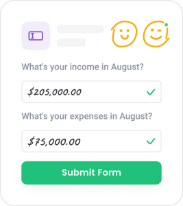
Building strong relations with a client means respecting their time. It’s time to work smart. Leave long forms in the past and use new tools that really work.

The basic building block of the Internet is the form. Forms are everywhere. You interact with registration forms in each new app, when you create posts on your blog or place orders on Amazon. These are all a part of simple user flows that have been honed over decades and contain a small number of standard fields for your user to fill in.
With the technological revolution and the increase in people’s access to the internet and smartphones, much of what used to be paperwork is now digital. It’s easy to interact with your customer through forms, whether a questionnaire, a quality of service survey, or more complex data collection cases, such as tax returns.
Assume your business relies heavily on collecting information and processing data from your customers. You need to employ programmers that would create forms for any of your wishes, which immediately increases your costs. Alternatively, you select from a variety of available online form builder solutions. Besides giants like Google Forms and TypeForm, Trisk is also stepping up to its Olympus of greatness.
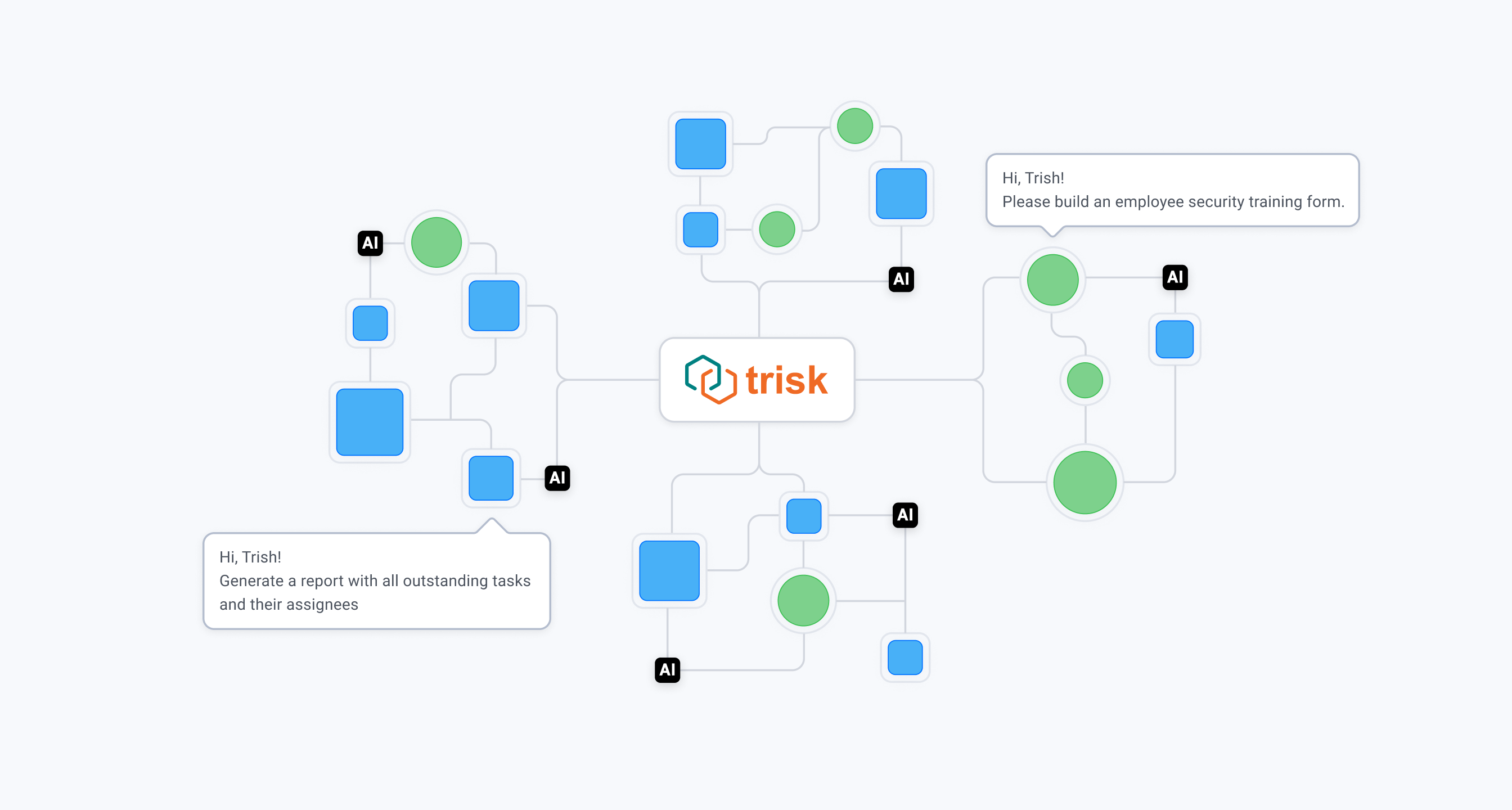
Trisk is much more than just forms. It enables users to build permission-based customer data collection flows where the form is a simple building block with notes, co-working, and history.
Trisk has been in this market for many years, and we know our users’ pains. The crucial part of the experience is the process and speed of filling forms.
Imagine creating an onboarding form for your client. You need to get answers to up to 100 different questions (you want to know all possible information about your client). It should be no surprise that half of your clients will open the form, see a large number of questions and close it until a better time when they find the strength and desire to go through them all.

You may wonder what you can do to change that?
One of the solutions we see is to add conditional logic. At Trisk, we call it “Show Conditions”. The logic behind it is that by completing fields like checkboxes, radio buttons, or selecting from a dropdown list, you can control the visibility of different questions and even sections later in the form. For example, if the client answers a question about the quality of your service negatively, the form can immediately display an additional field in which you can ask them to describe what they didn’t like. This will partially hide the number of questions for the user and show them only what’s relevant and necessary.
In general, such a feature may not surprise anyone. And, it does not always solve the above problem. On the contrary, it may only make the user angry because they don’t see how many questions they have left as their answers are always opening new ones.
That’s why we at Trisk went further with this logic and made a function we call “Conditional Run”. Its essence is that by filling in specific fields described above, the system launches separate, previously created, forms to your client’s dashboard. That is, if we are talking about the example above with your client and 100 questions – you can make 10 forms instead of 1, and they will be shown to your client when they answer specific questions.
This approach presents itself much better with clients of our customers for simple reasons – people tend to procrastinate. The smaller the task, the more likely it is to be performed. It is better to fill out one small form each day than one large form for five days. And you will receive and process data faster in small portions.
It’s about the psychology of human behavior. Your customers will be happier filling out five easy forms in a week rather than torturing themselves for one overly large form.
Is it worth doing business if your customers are not satisfied? Ours in Trisk are very satisfied.


