We are pleased to announce our Trisk’s Late June update that includes a Foldover update, a handy Mute Notifications feature in Help Desk, and a few additional User Experience enhancements.
The Foldover update
Before we start to talk about the update, here is a quick reminder about what Foldover is.
Foldover – Prior to today’s update, a blue arrow displayed near the top of your screen on the right side controlled a moveable panel, “a foldover”, that contained useful and actionable information. Depending on your permissions, there were three tabs at the top of the foldover:
- Details
- Tasks
- Progress
With this release, we updated the Foldover functionality to further unlock its potential.
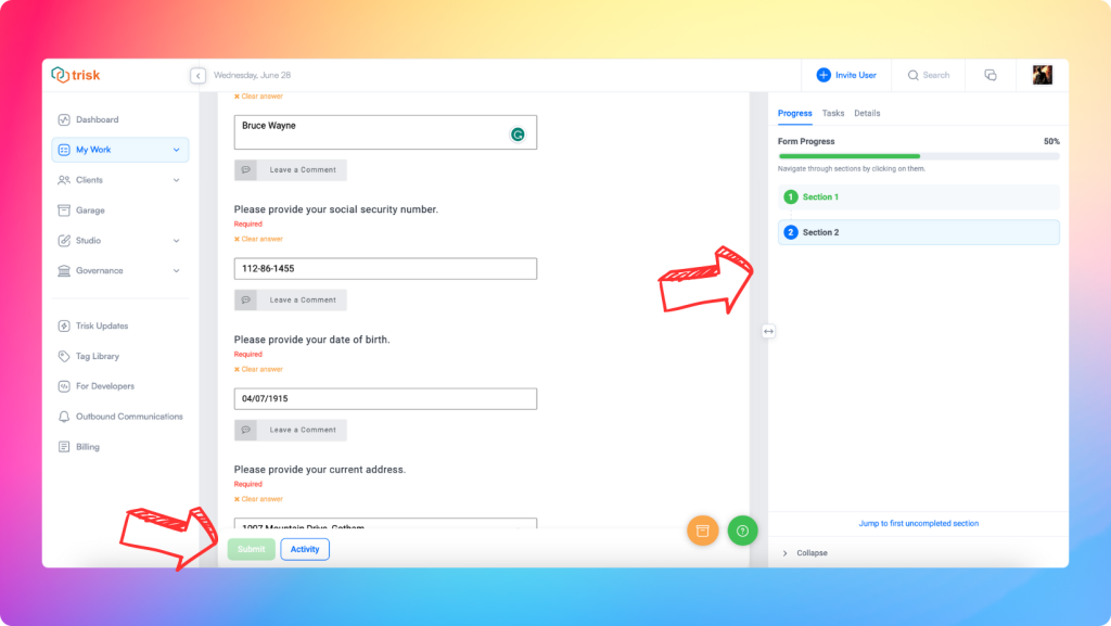
The Foldover is now always visible when the page is opened, eliminating the need to manually unfold it. This update enhances your ability to easily track the progress within each individual task and gain quick access to the necessary information on the active workflow. Additionally, you now can not only collapse or expand Foldover, but also resize it for more convenience. We believe these improvements will provide a more seamless and flexible interface for efficient form navigation and information access.
Foldover tabs have been upgraded and reorganized. Let’s look at each tab in detail.
Progress Tab
The Progress Tab provides a convenient way to track your form completion and navigate within a form. It has been made the default foldover tab and will be displayed when a form is opened.
- Previously located at the top of the page, the progress bar has been moved to this tab. This consolidates all your progress data in one place, allowing you to visually gauge the completion status through percentages.
- To further enhance usability, we’ve improved our colored circles linked to each form section:
- Green – indicates a complete section or when all required fields have been completed.
- Grey – signifies an incomplete section.
- Blue – highlights where you are in the form.
- “Jump to the first blank section” – This button enables you to swiftly navigate to the first field that requires your attention, which is especially useful for large forms, eliminating the need to scroll through the entire form to find incomplete sections. (We’d like to remind you that you can easily navigate through a form by clicking on the desired section number circle on this tab. This is really useful when you have a complicated form!)
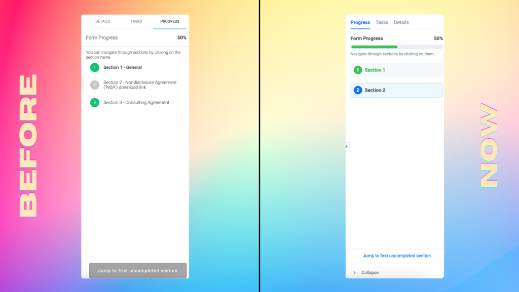
Progress Tab before & now
Tasks Tab
The Tasks tab is displayed when a Form includes questions with links to other Forms within a workflow. It contains information and options when responses to questions automatically launch other Forms.
In the Tasks Tab, we have made some improvements to enhance usability:
The IF/THEN Connect and Custom sections have been separated, providing a more intuitive and clear design for this block. Both of the sections include these updates:
- These sections can now be folded and unfolded for better organization and ease of use.
- The header now displays the number of forms available, making it convenient to keep track of the forms.
- Some buttons have been hidden in the three-dot menu for a cleaner interface.
In the Custom section we also have included a “Remove All” button in the header, enabling you to remove all custom forms with a single click.
Apply Forms from History:
- If there are no forms in the history, the “Apply forms from the history” button will be blocked, and a tooltip will explain the reason for the block.
Manage Assignees:
- You now have the ability to bulk change assignments for everyone, saving time and effort.
For users experienced with this tab, it is a powerful tool to customize what happens when the current form is submitted. You’re able to add, copy and delete forms. You can add identifiers to forms. You can determine to whom forms will be launched. It will save you a lot of time if you use the Tasks tab to error check what happens next before you submit a connected form.
These updates aim to improve the overall user experience, making managing and navigating the Tasks tab on the platform easier.
Details Tab
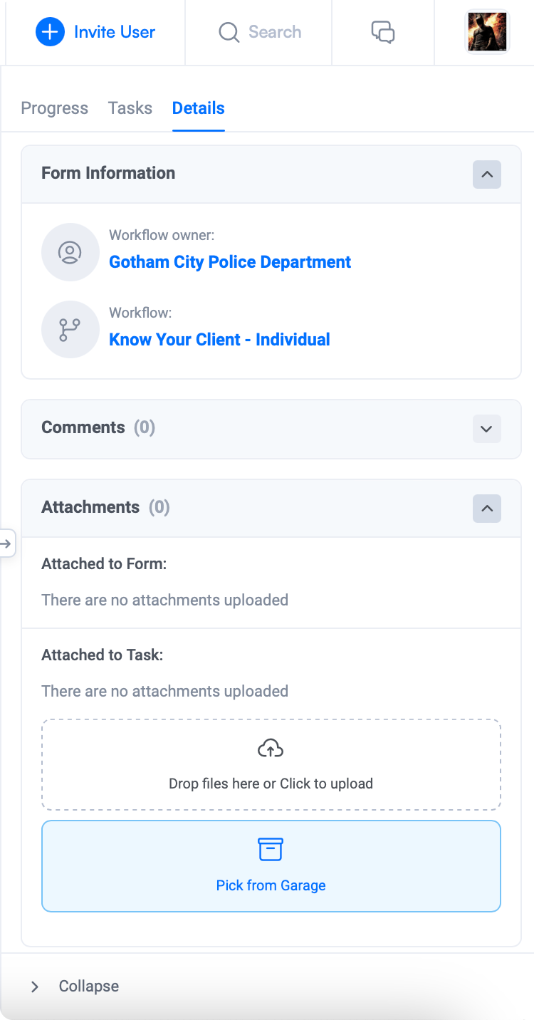
The Details tab displays more detailed information about the form, such as workflow owner, workflow name, comments and private notes, and attachments. By moving this information from the main screen, we’re freeing up valuable screen real estate to make Trisk easier to use.
As for comments, users can see all user comments associated with the current form. The number of comments is now displayed in the tab header. Clicking on a comment opens a comment box, and the page automatically scrolls to the desired comment. This streamlined functionality ensures seamless navigation and easy engagement with comments.
The Details tab showcases all files uploaded and attached to the current form relevant to the task. The block’s header now displays the number of loaded files, giving you an instant overview of the attachments.
The Details tab will also be the default tab if you’re reviewing and approving a Form rather than completing one.
Redesigned Details tab will better provide you with comprehensive insights and quick accessibility to crucial information. A dive deep into the form’s details, effortless engagement with comments, and easy access to relevant attachments, all at your fingertips. Enjoy the enhanced experience where important form information is easily accessible and conveniently organized.
Mute Notifications in Help Desk
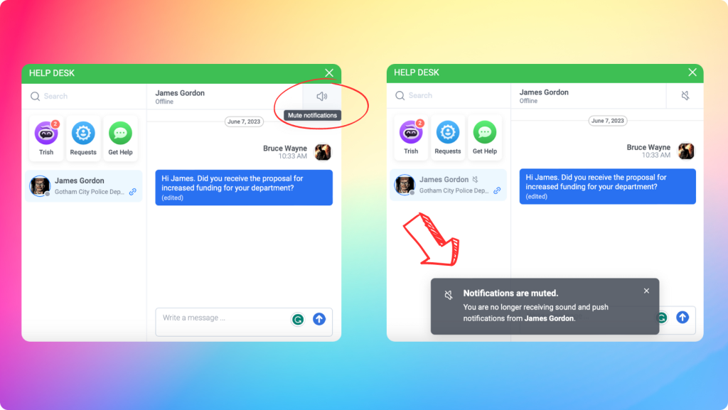
Introducing Mute Notifications, a handy feature designed to give you more control over your chats. We understand that your busy schedule sometimes requires your undivided attention, and staying on top of notifications can take time and effort. That’s why we’ve made it effortless to silence notifications for any chat temporarily. Simply head over to the Client Chats/Trish/Clients Requests/Get Help sections, and you’ll find the Mute Notifications button conveniently located in the chat header.
In Client Chats, once activated, a crossed-out gray speaker icon will be displayed next to the client’s name in the chat list, indicating that notifications are muted. Enabling or disabling Mute Notifications will trigger a pop-up message informing you about the status of audio and push notifications for incoming messages. It’s worth noting that the unread message count will still increase, ensuring you get all the important updates.
Moreover, when Mute Notifications is activated for a specific channel, sound and push notifications for incoming messages will be disabled – messages from this chat won’t clutter your email as unread.
Enhanced User Experience Updates: Form Identification, Button Placement, and Progress Bar Improvement.
We hope this month’s updates are inline with our continuing focus on making it easier for you to navigate, interact with forms, and monitor your progress.
- Updated Form Naming: Form names have been relocated and now appear at the top of the screen, making it easier to identify the specific form you are working on. For example, instead of just seeing “Fill Form,” you will now see a more descriptive name like “Fill Form – Interview.”
- Improved Button Placement: The Save, Submit, and Actions buttons have been relocated to the bottom of the page…and they are floating. This change provides a more intuitive user experience. Additionally, we add a display of the saving process, which gives you visual feedback on the status of your changes.
Follow our updates to keep up with the latest news. We always appreciate your feedback and are willing to consider your suggestions. Your feedback and inspiring success stories encourage us to improve Trisk and provide the best possible user experience.
If you have a story about how Trisk has helped you in your work, we would love to share it on our social media pages. Feel free to email us at info@trisk.io.
Best wishes,
Trisk Team
